For awhile, I had been avoiding of trying out new OS. Windows XP works so well that I rarely care about other OSs. Until last year, one of my colleges, who is more or less a Mac fanatic, talked me into getting a Mac. After many months of indecision, I finally brought a MacBook Pro, and got to experience what is like to use a Mac.
Mac OS X has many nice features that I wish to see in XP, but at the same time, I struggled to understand some of the UI design philosophies behind Mac OS X. I will talk about this concern in another time.
Of course, there is Windows Vista. Its bad reputations on the medias deter me from try it. I tried it one time, and the UAC pops up for pretty much for everything I do. Even opening your Control Panel would require your permission.
This week, I got a rare opportunity learn about Windows 7 in a 3 days training session. Yes, this is for software developers! There are hand-on-labs to do and you get to try to do some programming with the Windows 7 features.
So far, I like Windows 7 beta a lot. Here are some of the things that I like.
- Taskbar
- Libraries and Federated Search
- Background Services and Tasks
In addition, the session also covers Power Management, Multi-Touch and Ink, and the obvious the Windows Ribbon (Office Ribbon).
Snipping Tool
But first, I have to mention about this tool that I find in Windows 7 (Ultimate), the Snipping Tool.
This tool obviously does more than your typical “Alt-Print Screen”. You can do capture in these 4 modes:
- Free-form snip – allow you to draw around an area
- Rectangle snip – a rectangle screen capture
- Windows snip – allow you to select a windows and do a screen capture on it
- Full screen snip
In addition, you can draw and highlight the captured screenshot.
Taskbar
One major improvement that I find in Windows 7 compare with XP is the Taskbar
- Icon display only, no text, it saves you space
- Activate your program right from the task bar. There is no quick launch.
- All related windows are hidden in a single program icon, it only shows the running and pinned programming.
So, how do you see your opened Windows? You can simple hover your mouse pointer over the executing program on the taskbar and it will display all it related windows in a thumbnail.
In terms of programming, you can dictate what you want to display.
Preview
The taskbar get even better, than you put your mouse on the program thumbnail, all the other windows will become glass, leaving only your selected window.
In addition, you can close your windows with the little red cross button on the preview screen.
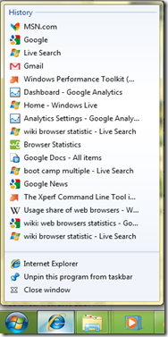
Notice that if you have multiple windows open, you can see the icon look like a stack:
Other things including the following also make the taskbar attractive:
The item in the Jump List and Thumbnail can be customized though Windows 7 API.
Ribbon
Ribbon from Office 2007 has comes to Windows7. Both Ribbons look very similar. My question is why not just rip the Ribbon out from Office.
Windows 7 Paint:
Windows 7 Word Pad:
Oh you can’t use Ribbon in Windows XP. Your application will not be able to run under XP if you have Windows Ribbon. For developers, this make our life a lot tougher. You either need have 2 different version of your program, or buy a third party ribbon that works in Windows XP.
Libraries
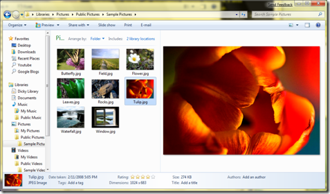
Another feature that I like is the Library feature. The concept is similar to Unix’s links. This is like a virtual folder where you can put whatever you want in it.
The idea is that you can use the library to “collect” other folders’ contents. For example, if I have a number of folders storing pictures, I can add these locations to the library and I can get a single view of all my pictures. This is similar to your Windows Media Player, or iTune where it scans all your music, videos and pictures into an organized folder view.
Libraries and Preview functions:
You can also create your own libraries:
One thing to note, my college and I have some concerns where the users may get confuse on how the folder system works. Note that if you delete the file from the library, it will delete it from your harddrive, which is not the same as a link. We will have to wait out the public feel about this feature.
UAC
One thing I notice that that Windows 7 is not as annoying as Vista. UAC only shows up when I try to run program in administrative mode, or when I install new programs. Opening your Control Panel doesn’t need your UAC permission, yeah!
Boot Time
Another thing I should mention is Windows boot time significantly faster because:
Less start up background service – Service that not needed are removed.
Delayed Auto Start service – Service that doesn’t need to start at boot time.
Service can start up by Trigger – A service doesn’t start up unless an event occurs.
These strategies help Windows 7 Start up faster.
Software Development
I never do any COM and unmanaged programming (C++) in Windows. Fortunately, Windows 7 SDK will comes with managed code for me to do Windows 7 programming in C#.
However, this SDK is not the final product from Windows 7, so use it at your own risk. .NET 4.0 should include the API needed to program in Windows 7.
Conclusion
There is a lot I want to talk about Windows 7, but I will probably stop here for now. In some ways, I feel that MS took a number of UI design idea from Apple. However, if it works, why not use it. One of the things I learn from the training is that programming in C++ (unmanaged) is a lot more troublesome compare with C# (managed). Am I glad I am working in C#!


2 comments:
I can't believe that in < 5 years I've gone from a Mac basher to "more or less a Mac fanatic" ;) Well, I'm going to stand by my position that the hardware is great and OSX does have a lot of nice features as well.
Just wanted to say that the new taskbar looks pretty cool, and I'll be interested to see if it translates well for power users. The icons for each task seem kind of small to present a good target.
Nice article.
Thanks,
After I brought my MacBook Pro, I have to agree that the hardware is great. I rarely encounter any problem with my MacBook when I run Mac OS X. It seems that Apple has done a better QA job than others.
I think Apple has an advantage on their hardware selections and testing. Windows on the other hand has to deal with a greater number of manufactures' drivers.
Post a Comment